Maker: Sheaffer.
The Taranis was the more avant-garde of two new pen designs Sheaffer released in its centennial year. Named for a Celtic thunder-god (those of you who are, like me, fans of Asterix, will be surprised to find that Toutatis is a different chap), the pen was designed by the architectural house of Charles Debbas, whose brief clearly called for a family resemblance to Sheaffer pens– it has the same square cross-section at the ends as the PFM, Imperial, and Legacy, which is clearly a conscious choice. The resemblance to a later version of the Stylist is probably less intentional.
With the cap off, the originality of the design comes clear, and when the pen was released there was a certain amount of polarization on that topic. Those who fell into the “don’t like it” camp levelled accusations of garishness at the decoration of the section, while those on the other side of the line declared it an interesting exercise in style. My own take on it is this: it is something like a prototype from the mid-1960s, a pen version of the “concept car” to show off what some nebulously futuristic output of the company might be. I can see the objections of those who oppose it, but I find it pleasant. I should also mention that the clip was another polarizing factor; it is astonishingly long, but it is also functional and lacks any goofy excrescences as one finds on the Stylist.
The point and feed are rather unlike Sheaffer’s usual output, and indeed one is hard pressed to find any kind of precedent for them in the company. They’re more like something from a Taperite Waterman of the 1940s, although without the possibility for flex found in those older pens. One might also look at the Eversharp 10,000 Word Pen for a vaguely similar point– in truth, the Taranis looks something like that pen with the arrangement of the point relative to the hood put right.
The performance of the pen is certainly of the sort one expects from a steel-pointed Sheaffer. My exemplar has a fine point, which exaggerates irregularities in the writing surface, but it is certainly smooth enough and offers a damp line. I suspect there is not a lot of buffering in the feed, as attaching a cartridge to the pen in a dry state saw a very quick transmission of ink from inside to tip. However, this suspicion is not borne out by giving the pen a good hard shake, which saw no drops of ink at all thrown onto the page. The balance is also quite good, and despite it having an all-metal body this is not a heavy pen. A very sensitive soul might find the texture of the name-plate atop the section troubling, if they also don’t pursue the modern version of the tripod grip. That same sensitive might also object to the odd degree of reverberation which seems to attend writing; my example, at least, is a lot louder than a smooth-writing pen pen normally is.
The one qualm I have in recommending the pen is the price. For a steel-pointed pen with no internal filling mechanism and performance which is only slightly beyond adequate, it is rather expensive. Since it has all but been dropped from the line-up, I am probably not the only one who feels this way.
Production Run: 2013 – present (although one might start looking at 2017 as the end date).
Cost When New: The 2013 MSRP was $145.00 or $165.00, based pretty much on the colour of the trim. The only model available after 2015 appears to be a Ferrari-branded model, selling for $140.00.
Size: 14.1 cm long capped, 15.0 cm posted, 12.2 cm uncapped.
Point: Steel.
Body: Brass (although the cap looks like it may be aluminum).
Filler: Cartridge , capacity approx. 1.1 ml.
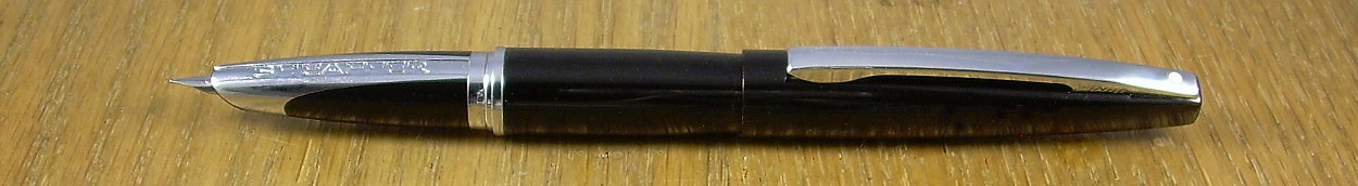
Sheaffer Taranis in (I kid you not) Stormy Black. In addition to the big name on the section, there’s a more subtle one on the side of the clip.

When capped it is a very sleek item (even when it’s not pretending to be covered in vantablack)
If you are relying on the preceding information to win a bet or impress a teacher, you should read the site’s scholarly caveat. Remember, this is the internet, and it’s full of bad information.