The eponymous Herbin was a French mariner of the late 17th century– he established himself ashore as an inkmaker in 1670, which is a remarkable long run at making a product.
The current Herbin inks include some of my personal favourites, and they’re highly regarded in general. They are also reputed to be amongst the safest inks available, both for pens (being low saturation) and the pens’ owners (“non-toxic” is not the same as “potable”, though).
Part of the reason I like these inks is that they seem to exemplify the great age of the maker. Most of the colours will amend on the paper in the course of a day, taking on a slightly faded, almost dusty cast. Unlike other inks, which may keep on fading, the Herbins that pull this trick seem to stop. Overnight, they age decades, but decades later, they remain the same. This can be seen as an unattractive attribute by some, of course.

Tipping it the other way presents a spilling risk, and not much better hope of getting ink in the pen.
The main complaints I have with Herbin inks are an inclination to feather on less than rather good paper, and the small bottles. This is not the jocular sort of complaint one might make about one’s drink, but rather an issue with the dimensions of the 30 ml bottles one has to deal with for most of the colours. The size and shape of them somewhat defeats filling a pen after about half the ink is gone, except in hooded pens, or oddities like the Snorkel line.
Some of the line are available in 100ml bottles (which should last a very long time indeed), and Herbin also offers cartridges for those whose pen lacks a filler.
Many of the colours are also remarkably water-resistant, although they’re not sold as such.
Examples (note– I’ve not calibrated my scanner, so these are mere approximations of the true colour):
![]()
Perle Noir: Black, and a good strong black it is. Very water resistant, although this comes at a price; flushing this ink takes a lot more work than most Herbin stuff, and I have a notion that it’s pigment- rather than dye-based.
 Éclat de Saphir: Standard blue. It is slightly less given to fading than a lot of other makers’ straight blue, which is a good thing. It does appear to be somewhat susceptible to mold, although this appearance comes about from a spike of reports in 2011; the company says it has addressed the problem now.
![]()
Bleu Pervenche: Extremely bright, similar to what Skrip used to offer as “Peacock Blue”; a tricky ink for a mature writer to use.
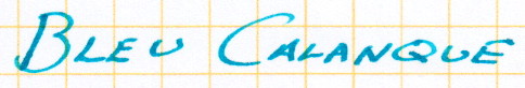 Bleu Calanque: Blue apparently meant to put one in mind of a creek.
![]()
Bleu Myosotis: Forget-me-not, and I think one of Herbin’s most successful attempts at emulating a specific natural colour. It goes onto the page as a medium blue, and fades into a remarkably warm colour slightly nearer purple. I might even call it a romantic colour.

Bleu Nuit: The closest approach in the Herbin line to a blue-black, it is really just a dark blue. The name is appropriate, as it is very much the colour of the sky just after the sun has set far enough remove any yellow from the sky– not a midnight blue, but more of a nautical twilight blue.

Bleu Azur: The daytime counterpart to the previous, it’s a little to pale to be festive, and while the packaging shows a sunny beach I can’t help but think “icy” looking a this colour. It’s probably something to do with where I live.
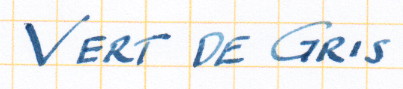 Vert de Gris: More of a blue-grey than a green-grey (and thus quite like the Rohrer & Klingner version of the same colour), which the colour indications on the packaging are honest in indicating. It’s very similar to the paler manifestations of Pelikan blue-black, and like that ink and Herbin’s own Lie de Thé it is resistant to removal by water. This probably means that if you get any on a shirt, it’s going to stay.

Vert Empire: A very mellow dark green, one might think of it as the green analogy of Bleu Nuit.
![]()
Vert Olive: A rather yellow green, not the sort of thing one usually thinks of in connection with olives.
![]()
Lierre Sauvage: This is Herbin’s version of the standard green ink.
![]()
Terre de Feu: This colour straddles the line between brown and red, although I find it leans a little too much towards red.

Lie de Thé: My favourite brown ink, the brown of a perfectly toasted marshmallow, with the inclination toward gold which that suggests. When exposed to water, the yellow components depart, leaving a relatively indelible graphite colour behind.
This is an example of the ink in a rather damp pen
Violette Pensée: In a wet pen this ink is a quite vibrant purple, well balanced between red and blue. In moderate pens, it emerges in this state, but in drying tends more blue and a little pale.

Pousièrre de Lune: A very interesting sombre, dusty purple.
 Larmes de Cassis: When used in a wet pen, this can be a fairly aggressive ruddy purple, but is otherwise in keeping with the generally muted nature of Herbin’s colours.
![]()
Orange Indien: A sunny, true orange, as close to the mid-point between yellow and red as one could wish.
![]()
Rouge Caroubier: Dark coral is probably the best way to describe this colour.
![]() Parfum Lavende: One of Herbin’s scented inks, this is subtle in both colour and scent, the latter being very difficult to detect once the ink is dry in anything less than a page full of text.
Parfum Lavende: One of Herbin’s scented inks, this is subtle in both colour and scent, the latter being very difficult to detect once the ink is dry in anything less than a page full of text.
![]() Parfum Violette: Also scented, but entirely less subtle. The smell is a good deal stronger, in fact, than the colour, so if sending a mash note to someone using this ink, be certain they’re not fragrance sensitive; it’s a pleasant, flowery smell, but there’s a lot of it.
Parfum Violette: Also scented, but entirely less subtle. The smell is a good deal stronger, in fact, than the colour, so if sending a mash note to someone using this ink, be certain they’re not fragrance sensitive; it’s a pleasant, flowery smell, but there’s a lot of it.
![]()
Rouge Hematite “1670”: An ink produced for the landmark (?) 340th anniversary of the company. It’s a deep, rich red, and is rather more highly saturated than Herbin inks generally entertain. A nice colour, but one which demands a pen that can be easily cleaned. Update: In spring of 2013, Herbin amended the formulation to reduced the risk of clogging; this also eliminates a golden sheen which was one of the ink’s more notable qualities, and some view it as just another red now. Update the second: About a year later, this stance was reversed; Rouge Hematite and the other “1670” inks (popular enough, it seems, to stop being a limited edition) are now known for the gold sheen; indeed, they brag about it, and it is now spoken of as “shimmer” to distinguish from the reflection/absorption shenanigans extremely saturated inks will get up to. They are also known for driving pen fans into fits of approach/avoidance conflict, as the reports of clogs remain few but the box inserts suggest cleaning the pen the minute you finish whatever you’re writing at the moment.
![]() Gris Orage: This ink is a dark enough grey that in most lighting it appears black. With its gold shimmer, it is apparently meant to embody the sort of filthy storm a mariner in 1670 would want nothing to do with.
Gris Orage: This ink is a dark enough grey that in most lighting it appears black. With its gold shimmer, it is apparently meant to embody the sort of filthy storm a mariner in 1670 would want nothing to do with.
![]() Bleu Océan: Blue and oceans have a long connection, of course. The depth of this blue, according to ad copy, also connects to indigo trade. If you have a pen you’re comfortable cleaning deeply with great regularity, I highly recommend it– the effect is something like having inlaid your paper with lapis lazuli.
Bleu Océan: Blue and oceans have a long connection, of course. The depth of this blue, according to ad copy, also connects to indigo trade. If you have a pen you’re comfortable cleaning deeply with great regularity, I highly recommend it– the effect is something like having inlaid your paper with lapis lazuli.
The preceding images don’t give a clear sense of the shimmer effect, while giving an… adequate… notion of the underlying colour. I’ve prepared a short video which inverts these virtues and vices; loads of shimmer, not so great with the colour. It also has some pleasant, relaxing music to accompany the images: