![]()

From the 1926 catalogue
This company was something of a johnny-come-lately to the world of pen-making. Walter Sheaffer was, at the beginning of the 20th century, a second-generation jeweller. The creation myth surrounding his establishment of a pen company relates that he designed the eventually-ubiquitous lever filler after a prolonged stare at an ad for Conklin’s crescent-fillers, but I have a suspicion that his line of work brought him into contact with pens rather more directly. Decorative overlays were offered by the manufacturers, but it was also something that appeared as an after-purchase addition, if one wanted a specific or at least personal pattern, and something which a jeweller would be able to supply. Whatever the truth of the matter, in 1907 Sheaffer had a workable design patented. In consultation with some erstwhile Conklin employees, he set up a factory for pen production in Fort Madison, Iowa and began to make pens in 1912 (the company’s incorporation date was 1 January 1913). This effort apparently cost him in the area of $35,000, which is in modern terms about three-quarters of a million; not an insubstantial sum, but for opening a factory it seems a pretty good bargain.
Happily for Walter, the pen-buying public seemed to think that the lever was both the bee’s knees and the cat’s pyjamas, because they bought his pens in numbers vast enough that, even with a constant background drain from lawyers defending the lever-filler copyright, the company grew at several times the rate of most other pen-makers. The first few years of Sheaffer production was mainly assembly of components produced by outside contractors, but the whole of the production process was eventually brought under Sheaffer’s own roof. The final step was in 1922, when the company began mixing its own gold alloy for point-making.  In 1920, Sheaffer introduced the Lifetime pen. Hitherto, the business end of the pen was a slightly shaky object, being made of a thin piece of a malleable metal, and a source of complaint about pens in general was point damage. Sheaffer’s solution was essentially to make the point several times thicker and charge a great pile of money for it. In return for forking over more than eight dollars (which is like someone today paying nearly a hundred), the pen’s owner got the right to have the pen repaired or replaced for the rest of his or her life, barring evidence of deliberate abuse. In 1923, this warranty got an external indication in the form of a white dot, which over the years became Sheaffer’s general-use trademark. It would be several years before other companies followed suit (Parker’s Duofold only offered a 25 year warranty, as a comparison). It should be noted that the dot migrates somewhat, depending on the age and configuration of the pen; the most common place for it is on the side of the cap just above the clip, if not on the clip itself, but it can be found on the barrel or at either end, too.

Any colour you like, except for purple. I’m not sure why.
Sheaffer’s next big splash was in 1924, with a step away from hard rubber as a barrel material, replacing it with a celluloid plastic called Radite, which was rather more durable than the preceding material and could be had in rather more festive colours. This move started an avalanche of other makers using the new material under a variety of different names, but Sheaffer reaped the benefits of being the innovator by seeing their share of the market jump to roughly 25%. In a market so replete with competition as was pens at that time, this was a remarkable accomplishment.
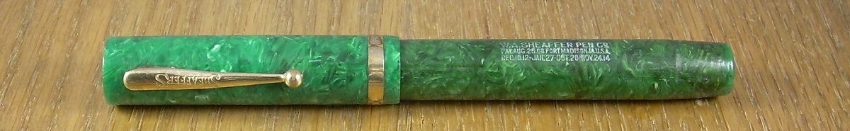
“Wait… that’s a PEN?! Well, 23 Skidoo!”
In 1929, Sheaffer pulled a similar stunt by radically changing the shape of pens. Prior to that year, the shape of the pen was well established as cylindrical, with perhaps a very little taper at the ends. Then, Sheaffer offered up the Balance line of pens, with dramatically tapered ends. Sheaffer’s advertising hinted at ergonomic advantages, although without the use of that as-yet-uncoined word, and this is not without a little basis in reality, but the main thrust of the Balances was the new look. As with plastic, there was a rush to emulation, with Wahl offering an “Equipoise” and Conklin a “Symetrik”, and if one looks at most pens today, fountain or not, the basic outline of the Balance is still there. {Update: Some recent scholarship puts the first appearance of the Balance in very late 1928}
The Balance remained the basic shape of the Sheaffer pen until the 1960s, with somewhat less striking innovation going on within that basic form. In 1935, Sheaffer began offering vacuum-filling pens; this filler would remain in use until 1948 and would always appear as an alternative to the lever-filler. In 1942, perhaps in response to the writing qualities of the Parker “51”, a new conical point was introduced which would take the name of the model in which it first appeared (the source of some comedic confusion in discussions amongst pen fanciers); the Triumph. This was also a persistent development, as Triumph points would remain in the lineup until the 1960s without a break, and then in an intermittent manner until 1998.
I should backtrack a little on the start of that previous paragraph, as Sheaffer did produce some non-Balance pens after 1929. Some of these were simply hold-overs of the old shape, one assumes to please buyers whose tastes had solidified in an earlier generation, while others were in the form of a a sub-brand which were run out in response to the Great Depression and concealed under the name Wasp (which was merely an acronym for Walter A. Sheaffer Pens). These are of lesser trim than the admitted Sheaffer pens, but of generally gaudy colours.
Sheaffer’s other response to the Depression was seemingly counterintuitive; profit-sharing was offered to the employees starting in 1934. I say “counterintuitive”, since the modern reaction to an economic downturn seems to be to cut costs, largely in the form of employees and their wages, but Sheaffer’s continued buoyancy through the 1930’s may be instructive to current economists. The elder Sheaffer stepped down and gave control to his son Craig in 1938, although Walter continued to offer his opinion on matters until his death in 1946. In 1947, Craig gave a speech which included this ironically prescient opening:
We are all aware in this immediate, post-war period that competition, together with a buyer’s market, is forcing the manufacturer to produce a higher quality product than ever before with corresponding decreased costs; and all this in the face of rising material and labor costs. Anyone can turn out junk; and many firms are doing this at the present time, selling their products very freely in the market. The future of these companies is not too bright. In the final analysis, the consuming public will decide which quality product they want; and we want them to decide on ours.
That is not, frankly, an attitude that gets your merchandise into a late 20th century big-box store. It was in the short term, however, an attitude which saw the employee profit-sharing plan add 50% to their wages, which had to be pretty good for morale.

The 1949 Stratowriter – earlier models were twist-operated and had a much higher chance of ruining a shirt
Sheaffer hit the post-war markets with new technical developments, the first of which was their entry in the mad race to release over-priced and somewhat unreliable ballpoints; the Stratowriter appeared in 1946, and from all reports was a bit of a failure in the area of unreliability, but scored top marks for being expensive. Fountain pen innovation came in the form of the Touchdown and then the Snorkel fillers; these were based upon pneumatic principles, and while less capacious than the vacuum fillers they replaced they were vastly less likely to fail in service and repairs were (and are) much less complicated. The company’s first cartridge pen appeared in 1955, and the inlaid point was introduced in 1959.
While all this was going on, the leadership of the company was handed on as Craig Sheaffer left in 1956 to take on the position of Assistant Secretary of Commerce in the US Government. His son, Walter Sheaffer II, took over. By this time, Sheaffer had branch plants in Canada, Australia and Brazil. The Canadian operation was certainly in production at least as early as 1936, and the Australian wing opened in 1951 (although it had been mentioned in the papers there as early as 1947). The Brazilian plant’s opening is, for the moment, an utter mystery to me. Walter the second appears to have been somewhat less committed to the family business than his forebearers. Ten years after taking over the company, he left it, and it fell into the hands of Textron, one of the early non-specific conglomerates (which of course means, “We’ll glom onto anything that makes us some money”).
This was sadly coincident with one of Sheaffer’s greatest stumbles, the Stylist, and the appearance that the company was entering some extremely hard times was hard to overlook. This sale took place in 1966, and those who attempt to date Sheaffers will want to note that this was after the company had dropped the apostrophe-S from the end of its impressions; sometime in late 1964, pens that had been marked SHEAFFER’S were henceforth marked SHEAFFER. Why they did this doesn’t appear; perhaps an effort to please an increasingly international market in which the English possessive form was just confusing.
It looks a lot older than it is
As it happens, after than initial stumble, Sheaffer continued under the new ownership in much the same way it had done previously. As the 1970s began, there was a bit of atavism to be seen in the designs the company offered, a return to the pre-Balance look of squared cylinders, which in some cases was a very clear backward glance; Art Deco and various things of the ’20s were in vogue then, and it is likely Sheaffer was merely following current fashion. In 1987, the company was sold to Gefinor, an investment group which apparently saw the chance to make a profit on it in 1997 with a somewhat ironic sale to Bic, but which didn’t do much about the day-to-day operations. Bic, on the other hand, has done rather a lot in that department, moving production of ink and then pens out of the home factory in Fort Madison, which it closed entirely in 2008.
Sheaffer pens are now made in various parts of the world, and the location doesn’t appear to have a bearing on the relative altitude of any given model in Sheaffer’s hierarchy; China, Italy, and the Czech Republic seem to be the main loci of fabrication. Fort Madison itself is still not entirely devoid of the influence of Sheaffer, despite the loss of the factory. A well-respected seller and refitter of vintage (and some new) pens has its existence there, and in 2011 a long-projected museum devoted to Sheaffer’s history opened its doors. If one digs around in the “news” section of Sheaffer’s own website, one discovers that some of the funding for this museum is coming from them, which indicates that there is at least a little nostalgia for Sheaffer as was in the Sheaffer of today. Update— the museum now has its own website as well, with quite a lot of pictures and offering the opportunity to become a sponsor.
Update: In August of 2014, Bic sold Sheaffer to Cross. This appeared to have had little immediate effect on Sheaffer’s operations, but by 2018 much of the upper end of Sheaffer’s output was discontinued. The brand now appears to be operated as a “popular” counterpart to Cross’s “luxury” line-up.
Models I’ve examined, after a quick note; you may notice that this chart is a little more complicated than those of other makers. Other makers tended to have several distinct models, perhaps with a couple of variations of size within each model. Sheaffer frequently exhibited a particular line, like “Balance” or “Thin Model”, in which they would have as many as a dozen variants, each with its own name and thus acting like a model. To keep from going mad, I’m setting up a page to deal with the overall aspects of the line, and each model page will deal very briefly with what distinguishes it from its fellows. I suggest that unless you’re interested only in the specific attributes of a model, read the page for the line first. Sheaffer had a terrible way of re-using model names, too, so even if you are just interested in the model, it might be worth looking into the line just to make sure you’re getting the right version of that model. Clear? Probably not, but such is the lot of the Sheaffer scholar. Also, if you’re holding a pen that you’re unsure of the model of, you may find the name more quickly by scanning through the Sheaffer family album:
| Alphabetically | By Date |
|
|