Pelikan makes a couple of different lines of ink for fountain pens. They offer a few shades of general utility ink under the “4001” label, but in response to a growing boutique-ink trend released in 2010 a premium line called “Edelstein”. At the moment, my experience is limited to the former line.
The Pelikan 4001 inks are, as befits a standard ink, without any really glaring flaws or glowing virtues. They tend to be slightly dry inks, to balance the slightly damp tendency of Pelikan’s feeds, and this leads the users of dry pens to not like them much. The only complaint I have with them is the slightly silly tendency to include the word “Brilliant” in the name of the colour.
Examples (note– I’ve not calibrated my scanner, so these are mere approximations of the true colour):
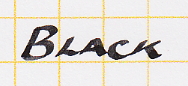 Brilliant Black: If I’m going to use a black ink, this is my usual choice. It’s relatively dark, and isn’t quite as much of a chore to clear out of a pen as some really dark blacks.
The “heavy” was achieved by slightly over-pressing the point so it would release more ink. I would have to use different pens and papers to give a complete sense of this ink’s range of potential.
Blue-black: This is a somewhat protean ink. It might be best thought of as a dark grey with a blue aspect which may or may not be evident depending upon the amount left by the pen and the nature of the paper. While not a reactive blue-black (like Lamy’s or vintage versions of the colour), it is quite resistant to water. In mid-2011, a rumour was circulated that it would no longer be imported into the US because of some kind of bureaucratic hassle regarding the constituent chemicals– they are not on a list of unsafe materials, but they are also not on a list of safe ones– which Pelikan was viewing as more expensive to sort out that it would be worth. A shame if true, as it’s one of my favourite inks to use when in the mood for some gravitas, and if it’s not going into the US, it’s probably not going into Canada either.
 Royal Blue: Pelikan’s take on “standard” blue. It is notable mainly for being what Pelikan urges upon the school kids, in the cartridges printed up for use in the Griffix and Pelikano Jr; the company offers an “eradicator” effective with Royal Blue, a felt-tipped pen with an ammoniac chemical that bleaches the ink out of the paper. This suggests that one should not make a habit of using this colour one documents meant to be archival. It can be a little feeble in a dry pen, but rewards long-term use in a damp one.

Violet: A bright purple, well balanced between red and blue, and not so bright that one hesitates to use it regularly. Strangely, it is not described as “brilliant”.
 Lilac: An apparently discontinued colour, this is a slightly redder and paler purple than the violet.

Brilliant Green: The name at least makes sense with this colour.

Brilliant Brown: This is probably the silliest colour name Pelikan offers. It is, I’ll admit, a quite bright brown, with elements of both red and yellow to it, but it’s still brown.