Maker: Sheaffer. For general comments on the mechanism, jump back to the Snorkel page.
See? If you click on this, you can see the whole manly ad in PDF form
Sheaffer’s PFM is one of the most forthright items of sexist marketing one is ever likely to stumble upon. The model name, uncontracted, is Pen For Men. Honest.
I’m not quite sure what moved Sheaffer in this direction; it’s not like there was a similar situation that saw the distinction between Tudor and Elizabethan clothing in late mediæval England, a sudden transition in the imbalance of power between the genders. At the end of the 1950s, the western patriarchy was as firmly in place as ever it has been, and there’s nothing in the career of Eleanor Roosevelt that quite jibes with this pen’s production dates. It appears that, like the hypertrophy of tail-fins in car design about the same time, it was merely a spasm of the moment, and the PFM is the same sort of decorative abberation as the ’59 Cadillac.
Unlike the tail-fin mania, the design impulse of the PFM appears to have remained limited to Sheaffer; there are no similarly swollen items in the line-up at Parker or Waterman, for example. Indeed, to judge by the 61 or the C/F, they were headed off in quite another direction. To judge by the general success at the time of the PFM, it seems that this departure of Sheaffer, unlike its pioneering use of plastic or the design coup of the Balance, was a bit of a stumble. While the PFM, in some of its grades, stayed in Sheaffer’s line-up for about a decade, it was not a wild success. This may be due to the radical nature of its styling, as length-to-width is not in line with most pens and gives an odd sense of stumpiness. I’ll leave it to a more dedicated Freudian to make something of this shape and of the fact that the pen is actually slightly shorter than the Imperials which joined it in the catalogue. I don’t think even the most fanatical follower of the Viennese doctor can make anything of a square cross-section at the ends of the pen other than a desire to be different from what had gone before.
One aspect of the PFM’s design which did manage to stand the test of public acceptance was the inlaid point. This was a new feature on the PFM line, brought in to replace the triumph point at the top of Sheaffer’s line, and it did so to the extent that it remains the signature styling point in Sheaffer pens to this day. The change from screw-on cap to a clutch mechanism was also one that persisted, appearing in the same three-stud-clutch form in the Imperials and the earlier Legacies, and indeed nearly banishing screw-caps from Sheaffer’s vocabulary; thereafter, they apeared only on the pointedly retro NoNonsense and Connaisseur models and the slightly conflicted Valor.
The PFM was the second pen to mount the Snorkel filling system (which I’m sure is also somewhat open to a Freudian viewpoint), and as it happened it was also the last. The extra width of the pen allowed for a rather larger reservoir than the previous Thin Model, but apart from a slight amendment to a couple of components to agree with the new shape the confusion of parts inside the pen remained the same.
The PFM also saw Sheaffer’s first use of Roman numerals rather than model names to differentiate between the trim levels in the line. There were five, consecutively numbered (which was not the case with the Imperials), PFM I being the base model and PFM V the grandest (although there was an “Autograph” model which looked rather more like a III but, through the use of a solid gold cap-band, cost like a V). In the modern market, these pens can be rather expensive, even at the low end, since lack of popularity in their day and a relatively high attrition through slightly more than usually brittle plastic means there is a quite limited availability. There was also a limited run of a hundred pens in what would be thought of as the “Masterpiece” trim, a solid gold body and cap, but this was a sort of special order by a jeweller and never appeared in a catalogue.
Functionally, there was no reason for the relative unpopularity of the PFM. The inlaid point is certainly a winner, and the filling system is both fun and efficient to use. My own prejudices require me to say that it is quite light, relative to similar efforts at the same thing in more modern Sheaffer products, and thus rather easier to use in a prolonged manner… whatever the gender of the user.
Production Run: 1959 – 1968 (PFM I, II, and IV withdrawn by 1963).
Cost When New: $10.00 to $25.00 (for modern values, try this calculator).
Size: 13.5 cm long capped, 14.0 cm posted, 11.8 cm uncapped.
Point: Either palladium-silver or 14k gold inlaid.
Body: Polystyrene.
Filler: Snorkel, capacity approx. 0.8 ml.
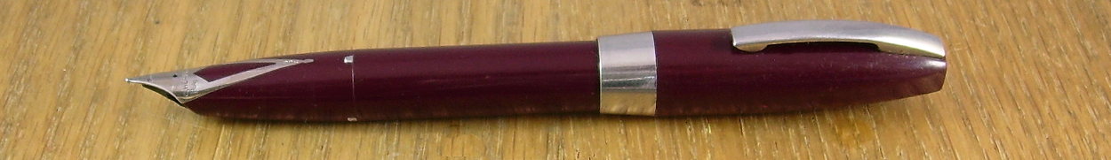
Sheaffer PFM I in burgundy. Note the absence of white dot on the clip.
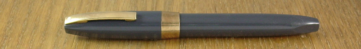
PFM III, showing the capped version of its stumpy profile. The difference between this and the base model is the upgrade to gold, in both the trim and the point, and of course the white dot. Original cost $15.00.

PFM V, the top of the line for PFMs unless you’ve got an Autograph.
As a way to tell the PFMs from Imperials in a photograph– the IV and V have a tail-plate like this, which is absent in Imperials.
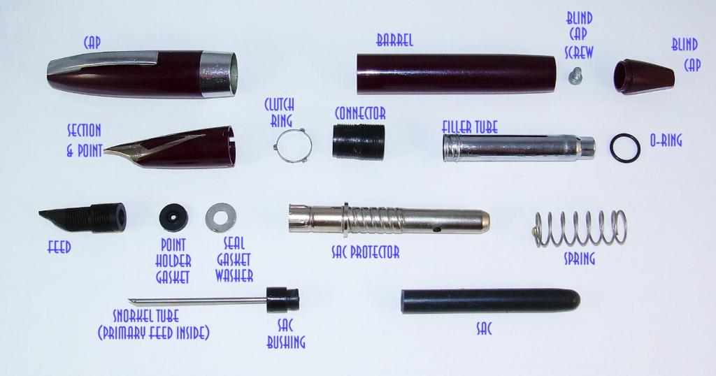
The PFM pulled to bits… and aren’t there a lot of them?
If you are relying on the preceding information to win a bet or impress a teacher, you should read the site’s scholarly caveat. Remember, this is the internet, and it’s full of bad information.