Maker: Sheaffer
The Balance line was a big world-shaker for pen makers, quite upsetting the shape of pocket pens. Prior to the Balance’s appearance, the shape of all pens was very much the same: a cylinder with a squared-off end with another slightly wider and similarly flat-topped cylinder for a cap. There may have been a slight tapering in the tail to allow the cap to be posted, but even this small angle may not necessarily have appeared. The Balance completely changed that, and as I mention in the main page for this maker, it seems to have set in the mind of the public what shape a pen should be with such firmness that the impression remains more than eighty years later.
This new shape did not occur in an utter vacuum. The new notion of streamlining was just starting to come into play as an extension of the Art Deco movement which had given so much of a distinctive look the 1920s, and streamlining was very much about knocking the corners off of stuff. As with the use of plastics, Sheaffer contrived to get in at the head of the line, or at least near enough the head that everyone remembers seeing them up there. The profile of the Balance was very like that of a Zeppelin absent the fins, and in 1929 it was hard to find a more aerodynamic form than that. This reshaping also had the effect of moving the centre of balance of the pen slightly towards the point, which made it more comfortable to use; I somewhat doubt this was any more than a happy accident developing out of a purely looks-based restyling, but it was certainly seized upon by Sheaffer’s ad-men. Update: a rather better scholar than myself has produced an article examining the precursors of the Balance, some of whom were not made by Sheaffer and date from the previous decade(!); I heartily recommend having a look.
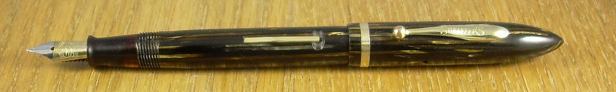
Mechanically, the first Balance pens were not much different from the pens which preceded them, with the same fillers, points and feeds. Even the clips remained the same as on the flat-tops, initially. In 1934, Sheaffer began to offer the Balance line with vacuum fillers, in competition with the Parker Vacumatic. The Parker pen claimed to be sacless, which as I mention on its page is somewhat spurious, and the new vacuum system was Sheaffer’s answer to them. This was a sacless pen indeed, with almost the whole of the interior space available for ink storage. Sheaffer did not, however, give up on the lever-filler, and both fillers were available side by side at the same price; I imagine the balancing act the buyer went through was one of enhanced ink capacity versus a more tried system which didn’t rely on some seals to keep ink from coming out a hole in the pen’s tail.
“Window Pane” version of a vacuum filler
Apart from internal capacity, there were a couple of small differences between the two styles of Balance. Most vacuum models had transparent panels in the bodies, with either a full length window or alternating lengthwise stripes of coloured and clear celluloid. In the lever models, the section sported a transparent area which would appear dark until the final few drops of ink were passing into the feed; a mere warning light as opposed to the fuel-guage enjoyed by the vacuum versions. There were also, of course, the external manifestations of the fillers, with the pen showing either a lever in the side or a blind cap.
As the Balance line persisted, the external shape amended slightly. The tail became less tapered and more rounded, more of a mirror of the cap. In 1938, Sheaffer began to apply model names to the various styles of Balance; before this, they had used the same sort of number-code as their fore-bearers, which was not particularly obscure (when compared to some) but also somewhat unsatisfying for the owner to relate.
The last innovation of the Balance line before it can be said to have ended was the military clip. This amendment appeared in 1940, to expand Sheaffer’s market to members of the armed forces. The regulations of the US military required any pen worn be of a shape that allowed the flap of a pocket to lie undisturbed. Parker had this concept well in hand (and had since well before the clouds of war loomed), as did Waterman, simply beause of the way they chose to apply their clips. Sheaffer’s pens, on the other hand, might well have attracted Freud’s interest through their flauntingly out-of-pocket nature. Some bright chap in Sheaffer’s design wing came up with a solution that was cheap and elegant all at once– mount a fairly mundane clip the wrong way up, then bend is back over the top of the cap. Not only did it meet the regulation, in arguably a more complete way than Parker’s top jewels allowed, but it was striking and allowed a separate line aimed directly at the military just in time for the military to become a very numerous sub-population.

Do not be confused between these two.
There is sometimes confusion between the military clip and the clasp on the later Tuckaway models; usually with the latter mistakenly being described also as military clips. As you can see in the adjoining illustration, they’re nothing alike, and the clasp really wouldn’t have satisfied the army’s requirements in the pocket-flap department.
In 1942 Sheaffer introduced the Triumph line, and in a broad sense that year can be considered the end of the Balance. This is a little too pat, though, since Sheaffer’s practices confound such an easy demarkation. Balance models, particularly military clips and low-end items, continued to be sold until at least 1945. More of an issue is the fact that the Triumph pens were an evolution from the Balance rather than a sudden departure from them; it’s not entirely incorrect to speak of a “Triumph-pointed Balance”. It’s also not incorrect to speak of 1942 as the end of the Balance era, as long as one is not too assertive in saying it.
There was a rebirth of the Balance in 1998. Like the earlier pen, it came in two different filler styles, lever and cartridge. It looked very much like the original pen, although in rather different colours and with a twin cap-band. It was also a good deal more expensive.
| One of the less appealling facets of the Balances was their slight willingness to have their caps posted. They frequently drop off, and an effort to get them to sit comfortably can lead to cracking the cap mouth. While some will post readily enough, I urge against forcing the issue. |
Balance models I’ve examined (in order of increasing cost):