Maker: Waterman
The Number Seven was basically an attempt by Waterman to respond to the sudden flowering of colourful celluloid-bodied pens without going so far as to actually shift production to the new material. The Number Seven was certainly festive, as it was not only introduced in red ripple rubber (which is somewhat different from the previously available red woodgrain) but also had a colour-coded band applied to the top of the cap. A dour person might say it was little more than a tarted-up No. 55, although the cosmetic changes, including a colour-specific point impression, take it off-spec. The coded insert actually makes for a longer cap, for example.
The code referred to the sort of point fitted to the pen, as a means of indicating immediately what sort of point the pen had, reducing the amount of searching on the part of both buyers and shop staff. The following chart gives the colours and what they meant, drawn from Waterman’s advertising over several years:
| Colour | Style |
|
|
The first six on this chart were available right from the start in the Number Seven, but apparently Waterman was concerned about there only being six styles of Seven; I’m not clear on the exact date that the seventh was brought into play. You may also notice that there are more than seven colours on this chart, but any given source of advertising only refers to seven of them, with Purple occasionally stepping aside for one of the newer variants.
There are a couple of variations in the Number Seven over the years. The lesser one appeared shortly after release, and is nothing more than the addition of a pair of white bands to flank the coded one; not only did this make it easier to “read” the colour than when it was up against the red ripple, it looked rather handsome.
The more profound change happened after the 1930 model year, when the body material was at last shifted to celluloid. Never one to avoid a stodgy decision, Waterman only released the Number Seven in black in the first couple of years of production before some of the more interesting colours which even Waterman was using were applied. The colour-code was moved to an inset disc on the tail of the pen.
A final variation appeared right at the end of the pen’s run when it was fitted with the odd Ink-Vue arrangement which had previously been limited to Waterman’s higher-end pens. These are apparently shorter again than the predecessor version.
Given the diversity of point styles this model offered, there’s little to be said about the writing properties other than they are generally as good as one should expect from a company that was in business as long as Waterman had been at this point. The Number Seven has the charm of giving a modern user some hint of the point’s specific attributes– flexy or firm, thick or thin– without having to actually write with it.
Production Run: 1927 – c.1939.
Cost When New: $7.00, throughout the run, regardless of material (for modern values, try this calculator).
Size: 12.8 cm long capped, 16.3 cm posted, 11.9 cm uncapped (rubber model; celluloid versions were slightly smaller).
Point: 14K gold.
Body: Rubber until sometime after 1930 (a catalogue dated 1930 still shows rubber for this model), then celluloid.
Filler: Lever , capacity approx. 1.5 ml. In the last year or so of production, it was an Ink-Vue filler of unknown (but probably rather greater) capacity.
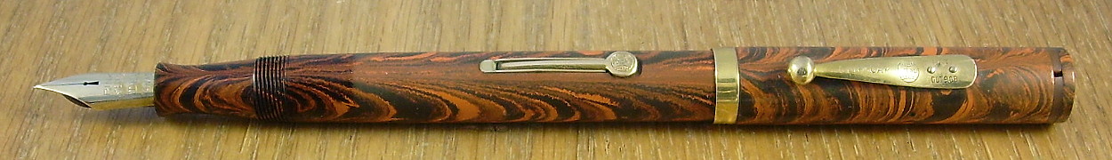
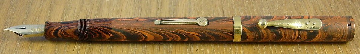
Waterman Number Seven Pink… although the years have not been kind to the colour-coded band. If you look closely, you can see that the lever box is a little buckled, which is what happens if you try to force the lever when the sac has gone hard. This is an early model, as the colour band isn’t flanked by white ones to make it easy to read.

Close up of the point shows the band-matching impression and the stereotype keyhole breather of this model.
If you are relying on the preceding information to win a bet or impress a teacher, you should read the site’s scholarly caveat. Remember, this is the internet, and it’s full of bad information.