Maker: Pelikan.
As ever in adverts, the insistence upon “new”. If you click here, you can see the whole thing over at FountainPens.It, which identifies it as a 1965 release.
This group of pens comes from a part of Pelikan’s history which most of the sources I’ve found barely acknowledge. At the end of the 1950s, Pelikan made an effort to bring its pen design into the modern swing with the introduction of hooded models. As the 1960s wore on, it became clear that less stolid and more gracile pens were the preferred shape (Parker hit the mark almost immediately, if they didn’t actually establish the trend, with the 45), and the hooded P1 developed into a range of semi-hooded pens.
Because there is little in the public domain about these pens, it’s hard to say with any precision what the reception of the new pattern was like. The fact that the pattern, with amendments, persisted until at least the end of the 1970s suggests that sales were brisk enough.
The main unifying feature of these pens is their overall shape; tapered ends, the hooded point mounted in a long, smooth section which is separated from an ink window by a moderate trim ring. Depending on one’s inclinations, one may include the Pelikano in this group, as the anatomy is entirely the same, but I’m leaving it aside since it has its own page already and a name rather than a model number. Model to model variations lay in the materials of point, body and cap, not unlike Sheaffer’s approach to their Thin Model lines of the previous decade.
Another unifying element in these pens is the startling simplicity of the feeds, which lack the convolutions one expects in pens of this relatively late age; there is a real possibility of dripping, via either thermal expansion or pressure variation. Interestingly, the owner’s manuals of the day made much of the pens’ ability to withstand the rigors of air travel due to the special nature of the feed, although there is a repeated and sensible insistence on removing the cap with the point upward when the urge to write aloft strikes. It is important, when filling from a bottle, to make very sure to de-flood the feed by expressing a few drops of ink back to the bottle and taking in some air; without this exercise, these pens will make a mess of your page in the first few sentences after a recharge.
This caution aside, or rather taken properly to heart, these pens are generally very good writers, although most who have tried them declare that they are not the zenith of smoothness as they cross the page. There is, at least in the early part of the run, a substantial difference between the steel points at the bottom of the range and the gold points which occupy most of the pens.
The exterior difference between M and P lies at the tail– one has a false blind cap to work the mechanism, the other a decorative fitting.
The early models in this line had a simple two-number model designation, and introduced the use of prefixes to indicate mode of filling: patrone (cartridge) and mechanik (piston), as well as kugel (ball) and drehbleistift (“turning” pencil) for not-pen versions of the same things.. although D was appearing on pencils somewhat earlier. One will find in some models a two-letter prefix, as in the MK10 below. In that case, the K stands for Kunststoff, which is plastic, and refers to the material of the cap.
Towards the end of the 1960s, possibly as early as 1968 but possibly as late as 1972, the pens of this group underwent a change of design which had their semi-hooded nature reduced to a mere vestigial widow’s peak, and in the points which went from triangular to something of a spade-shape. The difference between steel and gold point performance also just about vanishes, and this brings up an important caveat: don’t press down hard with the newer shape of these pens (the P12 and P488 below are examples of it). The change of shape in the front end of the section introduces stress points in the plastic, at the angle where the hoodlet meets the chin-ish portion that runs forward to enclose the feed, and pressing firmly on the pen will generate cracks very easily.
In 1973, Pelikan amended its numbering, switching from a two- to a three-digit system… although the precise arrangement of that system inclines a little more to the obscurity of Swan pens than the clarity(?) of earlier Waterman. These numbers technically spread to include Pelikanos of the same period, but I leave them to their own page as their career extends to either side of the majority of this family of pens. All the pens in this family adopt a number pattern of P4xx (only the M480, which succeeded the M10, seems to retain a piston after 1973), which suggests that a 4 in the hundreds place reflects the body style. Depending on how open you are, you may include the comtemporary P460 Pelikano and the P470 steno in this group; those with narrower views will see the bottom of the line as the P474, which is essentially a cartridge version of the M480. The final two digits become somewhat harder to rationalize, being somewhat like that of the New Classic’s numbers, where the ones place defines the body finish, while the tens place has to do with the point material, but some deviations from this pattern (which become more pronounced if one troubles to include the Pelikanos of the same age) mean that what one should really take from the tens place is a rating of relative costliness, more or less. While I’m touching on this, I should note that there was a series of M4xx pens that were made for export to Japan but which were in fact cartridge pens; I have seen speculation in this which suggests that there was a default inclusion of a converter in these export models, which with very broad interpretation of the meaning of the prefix letter makes sense of the change.
There is a small problem associated with the identification of these later pens which does not affect the earlier models. Where the ancestors had a model number stamped onto the cap, Pelikan fell out of that useful habit with the later creations. One will find GERMANY and PELIKAN, and in many cases some indication of the material the cap or body is made from, but nothing to define the model. On some models, there is more information which may be misleading, because it includes the material of the cap which sometimes is taken for the model name. On the M20 below, the impression reads PELIKAN 20 SILVEXA, and on the P488 one also finds a SILVEXA imprint, and this has led to some people saying “I love writing with my Pelikan Silvexa!” That is actually a nickel alloy which apparently Montblanc has also dabbled in, and which also graced the P1, although without the final ‘a’. There is less danger on other caps, such as the one which reads PELIKAN 30 ROLLED GOLD.
One can get a rough sense of whether these are early or late production pens from the shape of the clip. Two-digit and earlier versions of the three-digit models will have clip which is a very abstract version of the frequently-used bird-face, while later clips are rectangular with the company logo on the shoulder.
I’m a little unclear on just when this group ceased production, and will always accepts notes of assistance from passers-by. The majority of them have gone by the 1982 catalogue, displaced, one assumes, by the Signum, which was more in tune with the notions of “modern” by the late ’70s.
| I want to underline the tendency for the hood to crack in the post-remodel versions of this pen. Firm pressure is probably not a good idea with these pens, although it’s generally not a great thing for fountain pens in general. The examples of this problem I’ve encountered have also been low-end, steel pointed models, so it may be a result of more than common abuse at the hands of people just trying out a fountain pen; if this is the case, you may read the above as caveat emptor more than an operator’s warning, but that’s not an if I would want to rely upon. |
Production Run: 1965 – c. 1983, although only the M480 and P470 appear in the 1982 catalogue.
Cost When New: An ad from 1965 shows the range costing von 18.– bis 60.–DM, which works out to $4.50 up to $15 (for modern value, try this calculator). I have been told, without any details, that the Deutschmark was artificially undervalued for a long time after the war; prices on exported pens were probably more in line with those of similarly-featured competitors, but in Germany one would get this relative bargain (unless one lived there and got paid in DM, in which case it still hit the pocket book like a similarly-featured competitor would affect someone in it’s home market). Where I know the original cost of a given model, it will appear below.
Size: 13.4 cm long capped, 14.4 cm posted, 12.6 cm uncapped.
Point: See individual models.
Body: See individual models
Filler: Piston , capacity approx. 1.3 ml or cartridge, capacity approx. 0.6 ml X 2 or 1.4ml.
Models, in rough cost and chronological order:
MK10: Plated steel point, plastic body. Probably cost DM18.00
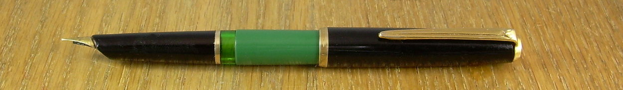
Pelikan MK10. One of my sources indicates that this green-barreled version was intended for export, while domestic examples were black.

It is worth comparing this pen to the Reform 1745. The less impressionistic beak-face clip on this model is NOT a sign of it being older, just cheap.
P12: Plated steel point, plastic body. Original cost DM10.00
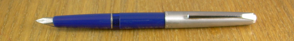
Pelikan P12, later model. The point once had gold-plating, but this one has been led a very rough dance.
M20: 14K point, plastic body. Original cost DM20.00 (the P20 was DM18.00).
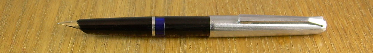
Pelikan M20. In an MK20, the cap hardware would be chrome
M30: 14K point, plastic body. Original cost DM30.00 (the P30 was DM28.00; this suggests a policy)
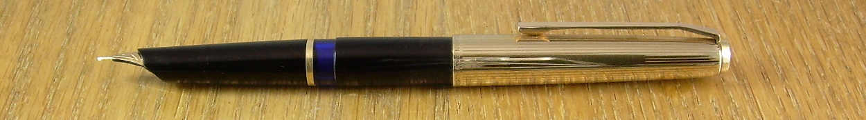
Pelikan M30 in profile, which shows both the interesting slope of the point and feed, and the narrow cartouche for engraving on the cap.
P488: 14K point, Silvexa overlay body.
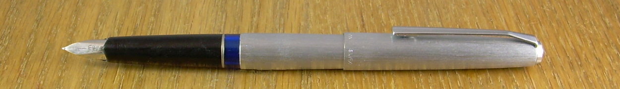
Pelikan P488 “Silver Star”. The SILVEXA impression is just visible on the cap lip.
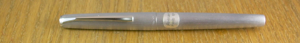
Capped, this pen looks a great deal like the current Lamy 2000M. The sticker is the only means of identifying the model number.

The MK10 anatomized, which I don’t recommend unless it’s absolutely necessary. It’s a long feed, yes, but there’s not much buffer there.
If you are relying on the preceding information to win a bet or impress a teacher, you should read the site’s scholarly caveat. Remember, this is the internet, and it’s full of bad information.