Pretty!
Diamine has been in the ink business since 1864, and if their website is any indicator, they seem to take exactly the right approach to their business: serious, but with a sense of fun. I am a big fan of Diamine, as their inks are generally willing to get along with any pen they’re put in. They offer a variety of bottle sizes, none of which have the geometric problems which afflict Herbin, and some of which are a pleasingly vintage shape which I can’t decide is more Victorian or Art Deco.
Examples (note– I’ve not calibrated my scanner, so these are mere approximations of the true colour):
![]()
China Blue: A pale blue, perhaps slightly less deep than that found in Delft china, but certainly in that area. I like it because, while it is the colour some makers’ standard blue inks eventually fade to (a rather rude trick), it is at least honest about its paleness and doesn’t get paler over time.
![]()
Majestic Blue: A highly saturated ink, which is a bit of a rarity for Diamine, it is all the name suggests; a deep, impressive blue. There is so much dye in it that a reddish sheen is frequently observed on the page. It is not at all water-resistant, and acts as a bit of a booby-trap for those who wet their fingers to turn a page. It’s a colour I love to look at, but the challenge of flushing it out of a pen is such that I rarely resort to it. I recommend it for vintage pens with simple feeds, as the cleaning is less of a penance.
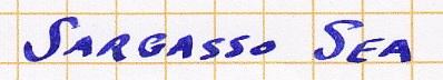 Sargasso Sea: Standard blue of a slightly over-saturated sort, with some nice depth. Less seaweed and pelagic crabs than one expects.
![]()
Royal Blue: A quite bright blue, moreso than most other makers’ version of this colour.

Steel Blue: A fine example of the difficulty in declaring the end of blue and the start of green. In some concentrations, and on some papers, the greenness of it is unavoidable. Ironically, it’s a colour that modern Quink blue-black will turn over time on many papers.
![]()
Prussian Blue: I might, if rumours about the unavailability of Pelikan blue-black prove founded, recommend this as a replacement. It’s a slightly greyish blue, although unlike that Pelikan colour it is definitely a blue in all uses. Also like the Pelikan ink, it is very dry; I’ve got several pens that is hardly comes out of.
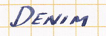 Denim: More of a blue-black than an indigo, but with a prominent blue element.
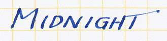 Midnight: Slightly lighter than Denim, it can be more easily made out as a blue than a black.
 Oxford Blue: A little lighter than Midnight, and inclines a little toward Prussian Blue’s greyness.
![]() Washable Blue: Very close to Royal in colour, but less intense, it is meant to be slightly less of a hassle to separate it from children and their clothes.
Washable Blue: Very close to Royal in colour, but less intense, it is meant to be slightly less of a hassle to separate it from children and their clothes.
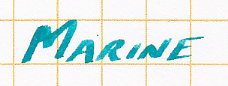 Marine: Slightly darker and somewhat less green than Steel Blue.
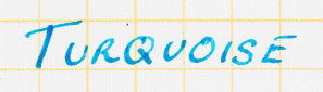 Turquoise: A bright, pale blue, with more of sky than of ocean in its tone. It is also reasonably true to the stone.
![]() Aqua Lagoon: One is tempted to ponder whether there are other sorts of lagoon which Diamine had in mind when they named this. It is a very Caribbean-from-above/swimming pool colour.
Aqua Lagoon: One is tempted to ponder whether there are other sorts of lagoon which Diamine had in mind when they named this. It is a very Caribbean-from-above/swimming pool colour.
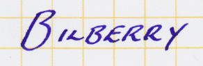 Bilberry: I’m not quite sure whether to call this a very blue purple, or a rather purple blue. It is somewhat less saturated than Majestic Blue, and also rather more freedom of flow, but has a similar visual richness on the page.

Amazing Amythest: A somewhat bluish purple, which generally comes out looking very like Herbin’s Poussiere de Lune, but which can with some paper/pen combinations take on what my wife describes as a “grape koolaid” aspect.
![]()
Imperial Purple: Certainly not a troublemaker like Majestic Blue; a good middle-of-the-road purple, perhaps even the sort one might find on the edging of a toga.
![]()
Syrah: A much more successful attempt than Claret (see below) to get the look of a good red wine down on a piece of paper. A bit of a challenge when time to flush the pen comes around.
![]() Writer’s Blood: A deeper version of Syrah, the richest burgundy ink I’ve yet encountered, and yet it’s not so over-saturated it affects flow. The sample here is somewhat washed out, compared to what the human eye sees.
Writer’s Blood: A deeper version of Syrah, the richest burgundy ink I’ve yet encountered, and yet it’s not so over-saturated it affects flow. The sample here is somewhat washed out, compared to what the human eye sees.
![]() Emerald Green: More of an idealized than an actual pursuit of the idea of emerald (see Chelpark for an example on the other side of that fence), but based on pictures I’ve seen it does look rather like Ireland.
Emerald Green: More of an idealized than an actual pursuit of the idea of emerald (see Chelpark for an example on the other side of that fence), but based on pictures I’ve seen it does look rather like Ireland.
![]() Delamere Green: A basic green ink, on the bluish side.
Delamere Green: A basic green ink, on the bluish side.
![]() Sherwood Green: Despite what my scanner thinks, this is a slightly less dark colour than Evergreen. It also inclines more toward blue than that colour.
Sherwood Green: Despite what my scanner thinks, this is a slightly less dark colour than Evergreen. It also inclines more toward blue than that colour.
![]()
Evergreen: An extremely mellow, woodsy green. It’s not quite a green-black.
![]()
Dark Brown: Actually rather ruddy; I’d be more inclined to call it Dark Rust.
![]()
Rustic Brown: Darker than Dark Brown, although still somewhat red of tone. A decent sort of chocolate colour.
![]() Ochre: I’m tempted to call this a “standard brown”; it is definitely a darker brown than Dark Brown, and is quite earthy. Update— flushing this ink out of a pen produced a remarkable amount of red; you might want to pause and consider before putting this ink into a pen given to taking on a stain.
Ochre: I’m tempted to call this a “standard brown”; it is definitely a darker brown than Dark Brown, and is quite earthy. Update— flushing this ink out of a pen produced a remarkable amount of red; you might want to pause and consider before putting this ink into a pen given to taking on a stain.
![]() Honey Burst: One of a group of inks made to emulate colours found in guitar bodies. This one is a the brownish-yellow, almost-orange of pale wood under shellac, which makes it a success on the shade front. I find it slightly inclined to feathering, but for something one could call orange, it’s not too hard on the reader.
Honey Burst: One of a group of inks made to emulate colours found in guitar bodies. This one is a the brownish-yellow, almost-orange of pale wood under shellac, which makes it a success on the shade front. I find it slightly inclined to feathering, but for something one could call orange, it’s not too hard on the reader.
![]() Oxblood: Very similar to Noodler’s red-black, but a slightly richer tone. It’s also very similar to Monaco Red and Syrah, being darker than the one and more brown where the other has its purple elements.
Oxblood: Very similar to Noodler’s red-black, but a slightly richer tone. It’s also very similar to Monaco Red and Syrah, being darker than the one and more brown where the other has its purple elements.
![]()
Monaco Red: I hope I’m not the only one who has to work to see the difference between this and Rustic Brown. This colour was apparently a special commission undertaken at the behest of the Grimaldis.
![]() Dragon Red: A little more brownish than this scan shows, it’s similar to Oxblood but brighter.
Dragon Red: A little more brownish than this scan shows, it’s similar to Oxblood but brighter.
![]() Classic Red: True to its name, a very old-school red ink. Not as profound as Skrip’s version, but bright enough.
Classic Red: True to its name, a very old-school red ink. Not as profound as Skrip’s version, but bright enough.
I’m not drinking that
Claret: Hot pink, really. It does look somewhat wine-like in the bottle, but the name is slightly misleading when it’s on the page.
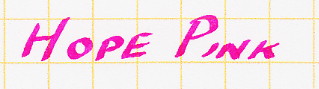 Hope Pink: This is a merry colour, the sort one might use for colouring a happy baby in a cartoon. It is also, relative to Claret, a slightly less chemistry-gone-mad pink.
![]()
Flamingo Pink: Slightly brighter than most flamingos you’ll have seen, but not an offensively bright pink.